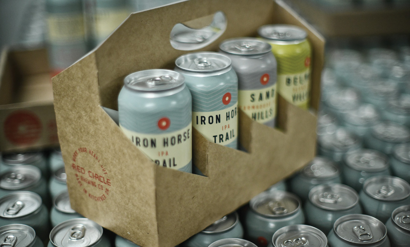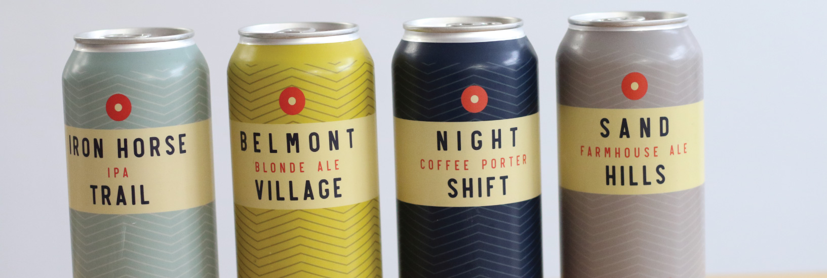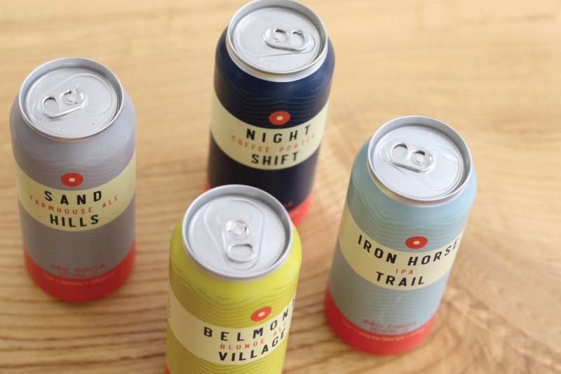

Almost one hundred years ago A&P supermarkets launched a brand of coffee that was sold in metal tins and ground to order. Inspired by the antique retro look of those classic Red Circle Coffee tins, we built our brand. By coupling the sleek look of the once-renowned brand’s vintage tins with a modern touch, we were able to ensure that our can designs would be unique and individual in the current marketplace (a marketplace that feels so illustration-heavy) – and that they would look amazing as a cohesive set.
- Chris Tiessen / Creative Director
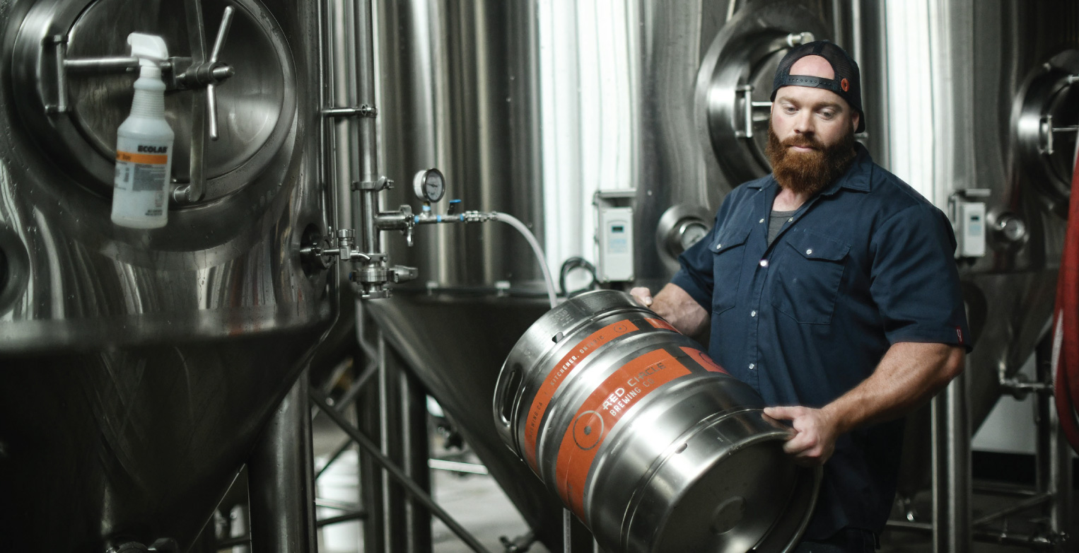
This project was multi-faceted and with many stakeholders at play – Red Circle Brewing is part of Catalyst 137, and is part of Graffiti Market. Red Circle Coffee & Red Circle Bakery (which also carries our emblem and brand work, is also part of the building.)